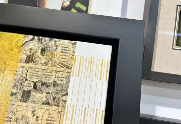
You’ve finally found the perfect piece of artwork for your home. Now comes another decision: what colour should the frame be Should you go with classic black? Natural wood? White? Or maybe something a little more colourful?
Many people start by looking around their living room, trying to match the frame to their furniture, flooring, or wall colour. While your home’s style certainly matters, there’s a little secret professional framers know: the best place to start is with the artwork itself.
The right frame should bring out the beauty of your artwork, not compete with it. Here are a few simple tips to help you choose a frame colour you’ll love for years.
Start With the Artwork, Not Your Furniture
When decide your Frame Colour
Imagine you have a beautiful landscape painting filled with soft greens, warm browns, and golden sunlight. You might automatically reach for a black frame because it matches your furniture.
But what if a natural walnut frame brings out the warmth of the landscape? Or a light oak frame makes the painting feel softer and more inviting?
That’s why professional framers look at the colours, style, and overall feeling of the artwork before considering the room where it will hang. The frame should feel like a natural extension of the piece.
Of course, your interior design still matters. Once you’ve found a few frame colours that complement the artwork, you can narrow down your choices based on what works best in your home.
Black Frames: Simple, Modern, and Timeless
There’s a reason black picture frames are so popular. They’re versatile, elegant, and work with almost any interior style. Black frames create contrast, making them particularly effective for black-and-white photography, modern prints, and colourful artwork.
For example, imagine a bright abstract painting with bold reds, blues, and yellows. A simple matte black frame can help contain those colours without competing for attention.
However, black isn’t always the best choice. For delicate watercolours or artwork with very soft colours, a heavy black frame might feel too strong.
Our tip: If you’re considering black, pay attention to the width of the frame. A thin black moulding creates a completely different look from a wide, dramatic one.
White Frames: Clean, Light, and Contemporary
White frames are a great option when you want your artwork to feel fresh and understated.
They work particularly well with minimalist prints, soft watercolours, botanical illustrations, and photography.
Imagine a delicate watercolour painting featuring pale pink flowers and soft green leaves. A white frame with a warm ivory mat can create a beautiful, airy presentation without distracting from the artwork.
White frames are also popular for gallery walls because they create a consistent appearance when displaying several different pieces.
Just remember that not all whites are the same. Bright white, warm white, and cream can produce very different results depending on the colours in your artwork.
Natural Wood Frames: Warmth and Character
If you’re looking for something that feels inviting and timeless, natural wood frames are worth considering.
Wood tones can bring out the warmth of artwork while adding texture and character.
For example, a vintage travel poster with muted orange, mustard yellow, and olive green might look beautiful in a walnut frame. Meanwhile, a coastal photograph featuring soft blues and sandy tones could work wonderfully with light oak or maple.
Different wood finishes create different moods:
- Walnut: Warm, rich, and sophisticated. Great for vintage artwork and mid-century modern interiors.
- Oak: Natural and relaxed. A lovely choice for landscapes, photography, and contemporary artwork.
- Maple: Light and subtle. Works well with minimalist prints and Scandinavian-inspired spaces.
At Framagraphic, we offer a wide selection of wood frame mouldings, allowing you to compare different tones and finishes before making your decision.
Gold and Silver Frames: A Little Elegance Goes a Long Way
Metallic frames aren’t just for traditional paintings or fancy portraits.
A simple gold frame can bring warmth to artwork with earthy colours, while silver can complement cooler tones such as blues, greys, and whites.
For example, a vintage botanical illustration might look beautiful in a thin antique gold frame. A modern black-and-white architectural photograph could benefit from a sleek silver moulding.
The key is choosing a finish that suits the artwork.
A subtle brushed gold frame feels very different from an ornate, shiny gold one. Both can be beautiful, but they create completely different impressions.
Can Frame Colours Change How Artwork Feels?
Absolutely! Colour has a big influence on how we experience a piece of art. Think about the feeling you want your artwork to create.
A natural wood frame often feels warm, comfortable, and organic. Black can create a sense of sophistication and contrast, while white feels clean and peaceful.
Gold can add warmth and a traditional touch, while silver often feels cooler and more contemporary. These aren’t strict rules, of course. The same frame colour can look completely different depending on the artwork. That’s why comparing moulding samples directly against your piece is so helpful.
Don’t Forget About Matting
Sometimes the perfect frame colour isn’t enough on its own. That’s where custom matting comes in.
A mat is the border between the artwork and the frame. It creates breathing room around the image and can help connect the artwork’s colours to the frame.
For example, if you’re framing a photograph with warm beige and brown tones, a soft cream mat paired with a walnut frame might create a more balanced appearance than a bright white mat.
You can also use double matting to introduce a subtle accent colour from the artwork.
The goal isn’t to match every colour perfectly. It’s to create a combination that feels natural and lets the artwork shine.
What If You Love a Frame That Doesn’t Match Your Home?
Here’s something worth remembering: your furniture and wall colours might change over time, but your artwork could stay with you for decades.
If you choose a frame simply because it matches your current sofa, you might find yourself wanting to replace it after your next renovation.
Instead, consider choosing a frame that complements the artwork first. A well-chosen frame can look beautiful in many different spaces, even as your decorating style evolves.
And if you’re unsure, that’s perfectly normal. Sometimes a frame that looks ordinary on the sample wall becomes the perfect choice once it’s placed next to your artwork.
Let Framagraphic Help You Find the Perfect Match
Choosing a picture frame should be enjoyable, not overwhelming.
At Framagraphic, we’ve been helping Vancouver residents find the right frames for their artwork since 1976. With approximately 1,300 to 1,500 picture frame moulding samples available, there’s plenty to explore, whether you prefer something modern, traditional, colourful, or completely unique.
Our experienced team can help you compare different frame colours, finishes, and matting combinations to find a look that complements your artwork and fits your budget.
Bring Your Artwork In and Let’s Find the Right Frame
Still deciding between black, white, natural wood, or something more colourful?
Visit Framagraphic for custom picture framing in Vancouver and see how different frame colours can transform your artwork. Bring your painting, photograph, poster, or special keepsake, and we’ll help you explore the possibilities.
Call +1(604) 738-0017 or book an appointment. We’d love to help you create something you’ll enjoy displaying for years to come.
Recent Post